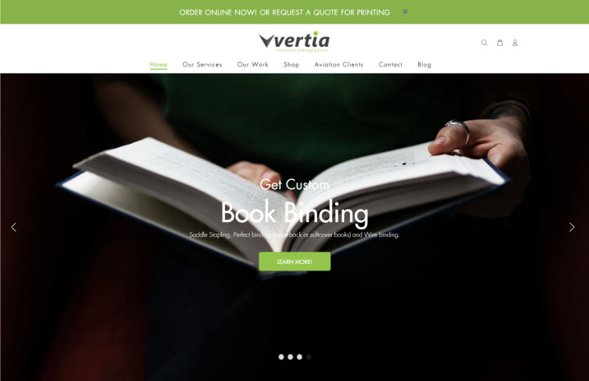
When the Colour Guy, a local digital printer which originally specialized in low-run and large-format jobs, needed a new brand, we were asked to come up with one that embraced its future.
Digital printing had come a long way and the Colour Guy found itself doing larger runs. It was also on the forefront of technology, with the latest equipment and beta-testing software as part of a worldwide programme. Finally, it was conscious of the environment, looking at energy conservation (a sister company wound up doing solar energy) and sustainable paper stocks.
When we come up with a new name, we go to the root: among of our oft-referred books is a two-volume dictionary with an appendix on Proto-Indo-European words and morphemes. Going back to that, we brought together ideas around virtual, green, and technology. The result: Vertia.
While Vertia didn’t adopt our logotype (it developed one in-house), it has found success with its new name.
We followed this up with trade mark registration (and subsequent renewal) for the client.

