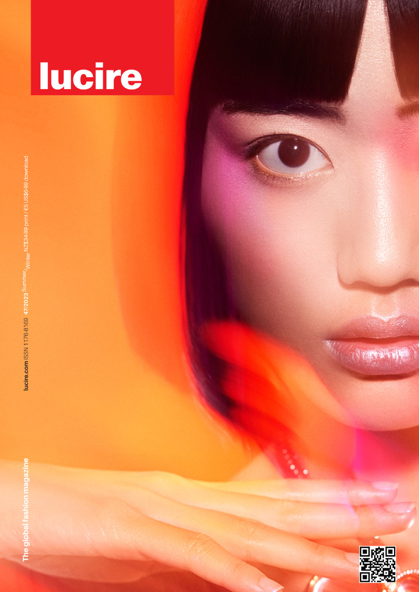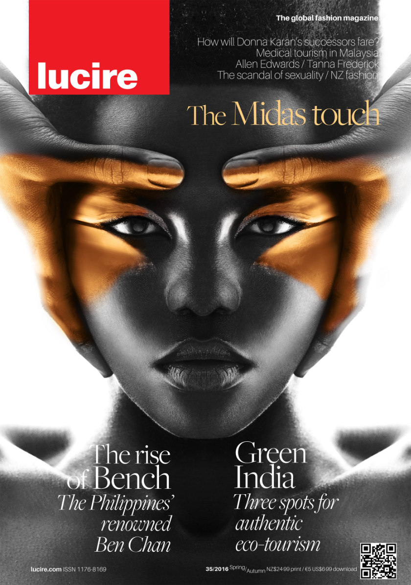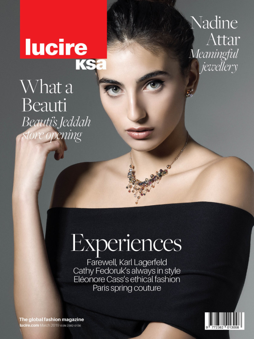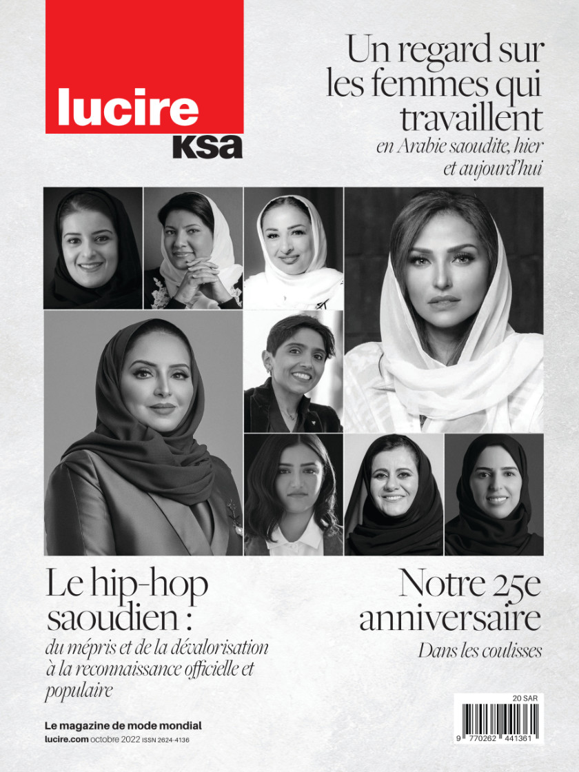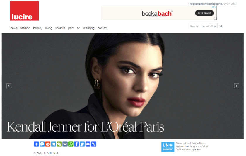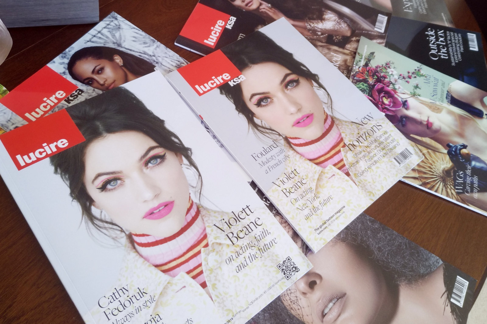

There was no template available when Lucire was created as New Zealand’s first commercial online fashion magazine in 1997. We came up with the logo, meant to be the antithesis of established titles such as Vogue, Harper’s Bazaar and Elle: it’s why the word Lucire is all in lowercase and rests at the bottom of the red box, and not the top. It’s also why the typeface (later changed to a custom one by us) is a sans serif.
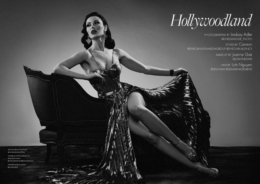
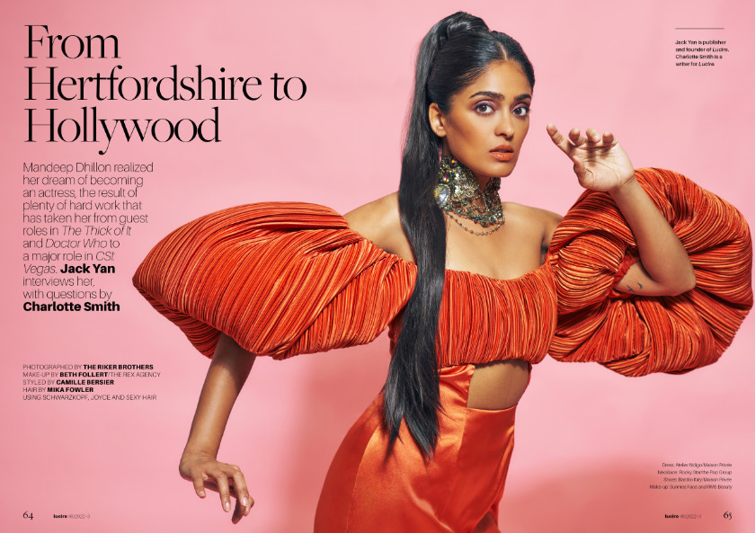
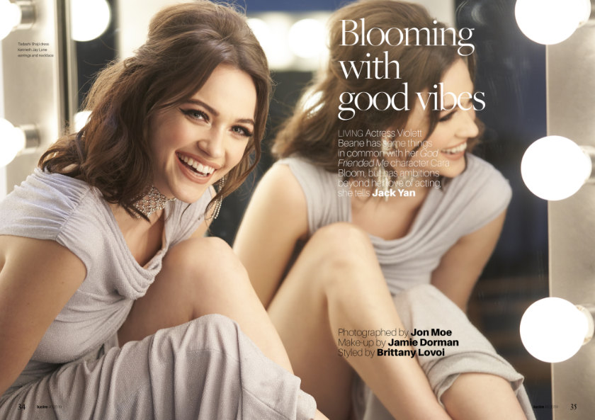
In 2003, we began looking at extending the brand into print, an unprecedented move. Having come up with every web template, we adapted its elements to print, and we have led every redesign in both media since.
Lucire’s entire identity system is our work, as is all its marketing collateral.
Also unique is that Lucire is New Zealand’s only magazine brand that is licensed to other countries, where it has found greater success than in its home market. From the outset it had to be international. Print licensees usually opted for the look of the master edition in New Zealand, so the work had to be internationally adaptable.
Beyond its home market, Lucire has had publishing histories in Romania, Thailand, Qatar, Bahrain, Saudi Arabia, and the US.
